Why Your Business Sign Needs to Be Readable at 50 Feet
Need this made for your team?
Send your artwork or idea and we will come back with a price in one business day. Bulk pricing available.
I remember driving down I-35 toward New Braunfels a few months ago, trying to find a specific lunch spot a friend recommended. I knew the name, I knew the general area, but I ended up circling the block twice because their signage was basically a piece of art that looked great in a magazine but was impossible to read from the road. By the time I actually saw the name, I had already missed the turn. That frustration is exactly why your business sign readability is the single most important factor in your marketing plan. If folks can't read your sign from 50 feet away, you are essentially invisible to anyone moving faster than a slow walk.
The golden rule of visibility
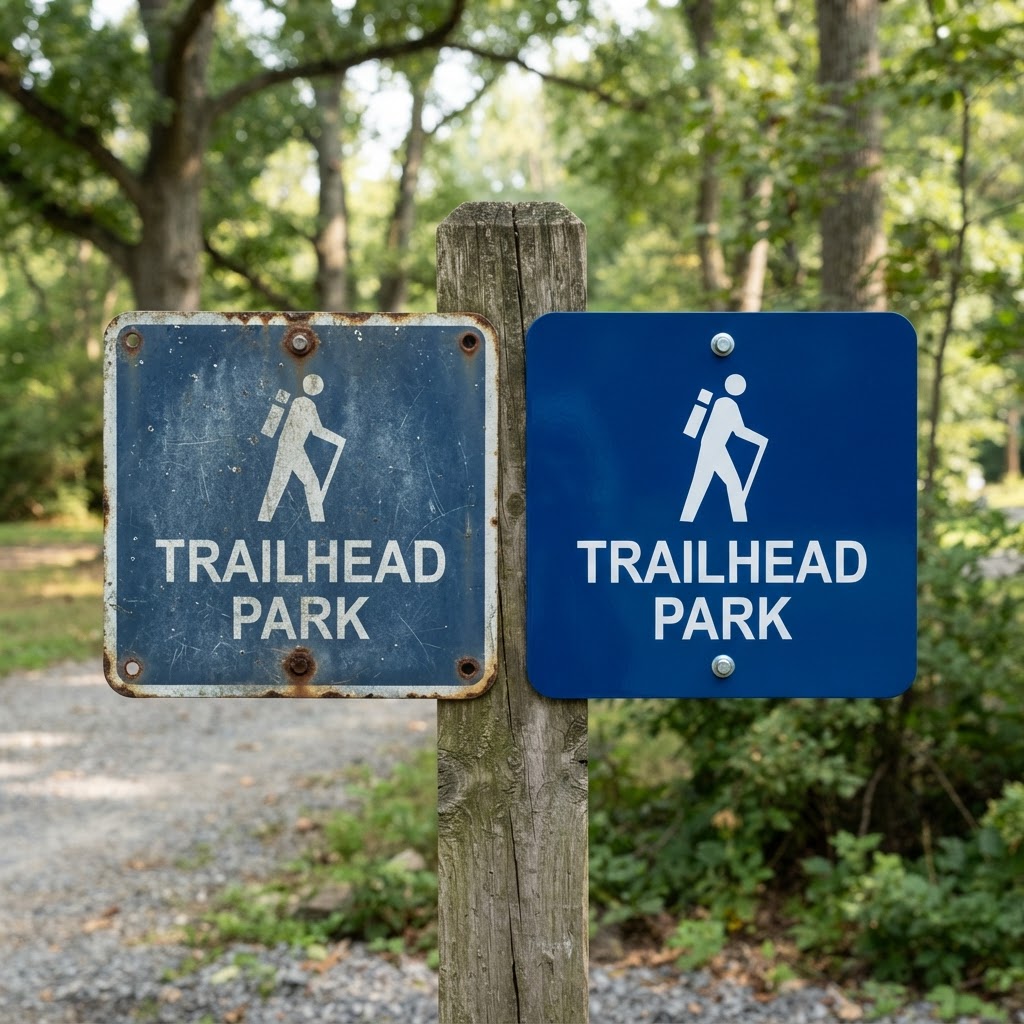
Look, we see it all the time here at Perfect Etch. A business owner comes to us with a beautiful, intricate logo that they want on a metal sign. The design is elegant, the lines are thin, and the font looks like it belongs on a wedding invitation. It looks stunning when you are holding it in your hands or looking at it on a computer screen. But here is the thing about storefront sign design. A sign is not a brochure. You do not have the luxury of someone standing three inches away to admire the flourishes.
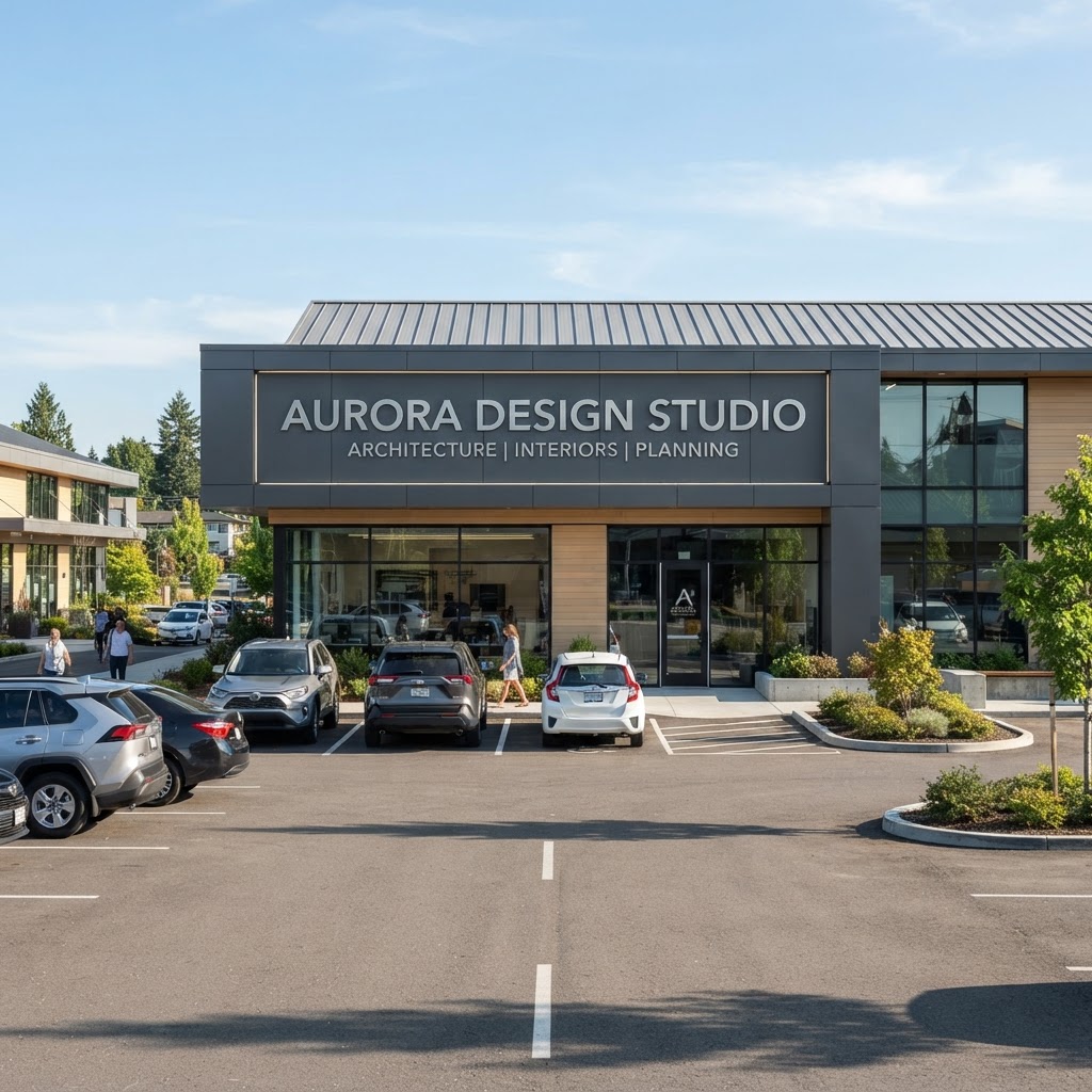
If you are located off a road where cars are moving even 25 or 30 miles per hour, your sign visibility distance needs to be high enough that a driver can spot you, process the information, and decide to turn without slamming on their brakes. Fifty feet is a solid baseline. If you want someone to see you, slow down, and pull into your lot, they need to know who you are from that distance. If your sign is cluttered or your font is too wispy, you are losing customers before they ever make it through your door.
Why metal signs change the game
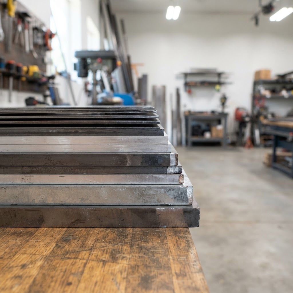
We specialize in metal signs because they offer a level of durability and professional polish you just don't get with vinyl banners or cheap plastic. When we laser engrave or cut metal, we are creating something that has physical depth. That depth creates shadows. Those shadows provide contrast. Contrast is your best friend when it comes to readability.
A flat, printed sign can wash out in the harsh Texas sun. We have all seen those faded signs that look like they have been through a decade of drought. When we work with brushed aluminum or heavy duty steel, we are thinking about how that material will look at noon when the sun is beating down on it. We choose designs that stand out against the metal finish, ensuring that your business name is punchy and clear. Honestly, metal adds a weight and authority to your brand that tells people you are here to stay. It is the difference between a popup shop and a staple of the New Braunfels community.
Font choices that actually work
If I could give you one piece of advice about your signage, it would be to skip the fancy scripts. I know, they look classy. But from 50 feet away, a script font just looks like a blurry line. You want high contrast, thick strokes, and clean spacing. When we help customers design their metal signs, we often push them toward sans serif fonts. These fonts have clean lines that do not blur together when the eyes are moving past them at 30 miles per hour.
Think about the street signs you see while driving. They are almost always simple, bold, and high contrast. They are designed for quick comprehension. Your business sign should be doing the exact same thing. If your logo is complex, we can often work with you to simplify it for the main exterior sign while keeping the intricate details for the smaller, indoor decorative pieces we do. You can have the best of both worlds. Use the bold, legible version for the folks on the road and the detailed, engraved version for the folks sitting in your lobby.
The logic of negative space
Another common mistake is trying to cram too much onto one sign. People think they need to include their phone number, their website, a list of services, and a social media handle on their storefront sign. Do not do this. If you are going 30 miles per hour, you are not writing down a phone number. You are lucky if you catch the name of the business.
Use your sign to do one job. Tell people who you are. Leave the extra info for your website or a smaller sign by the door where people are actually on foot. If you have a large metal sign, keep the text large and use plenty of negative space. That white space, or rather, the blank metal space, gives the eyes a place to rest and makes the text pop. It makes the sign feel intentional and professional rather than desperate and cluttered.
Getting the contrast right
When we are doing custom metal part marking or engraving, we pay close attention to the way light hits the surface. With outdoor metal signage, you want the letters to be dark and the background to be light, or vice versa. Avoid low contrast pairings like grey text on a silver background. It might look sophisticated in your office, but outside, it will disappear into a grey blur.
We love using contrasting finishes. A matte finish for the background and a polished finish for the letters can create a subtle, high-end look that is still perfectly readable because the light reflects off them differently. It is one of those small details that makes a sign look like it cost twice what you actually paid for it. That is the advantage of working with a shop that understands the physics of engraving and metal fabrication. We are not just printing a file. We are crafting an object that has to perform a specific job in a specific environment.
If you are looking to upgrade your presence or just want to make sure your new sign is going to do its job, come by and see us. We are always around the shop and happy to look at your current design to see how it will hold up at a distance. We love helping local businesses in Central Texas look their best, so feel free to swing by or send us a message if you want to chat about your next project.
Tell us about your project
Share the basics and we will come back with pricing, options and a timeline. No obligation.