ADA-Compliant Metal Signs: What Commercial Buildings Actually Need
Need this made for your team?
Send your artwork or idea and we will come back with a price in one business day. Bulk pricing available.
Ever had a moment where you walked into a brand new building in New Braunfels and felt like you were playing a game of hide and seek just to find the restroom. It is frustrating for anyone, but for people with disabilities, it is more than just a minor annoyance. It is a barrier to independence. Here at Perfect Etch, we spend a lot of time crafting metal signs for shops and offices across Central Texas. We see plenty of owners who get nervous the second they hear the letters ADA. They think it is some complicated government riddle that is going to cost them a fortune in fines. Honestly, it is not that scary once you peel back the layers.
The basics of being accessible
Look, the Americans with Disabilities Act exists for a simple reason. We want everyone to be able to navigate a public space without needing to ask for help every five feet. When we talk about ADA compliant signs, we are really talking about clear communication. If a person cannot read the sign because the contrast is poor or the letters are too small, the sign might as well not be there.
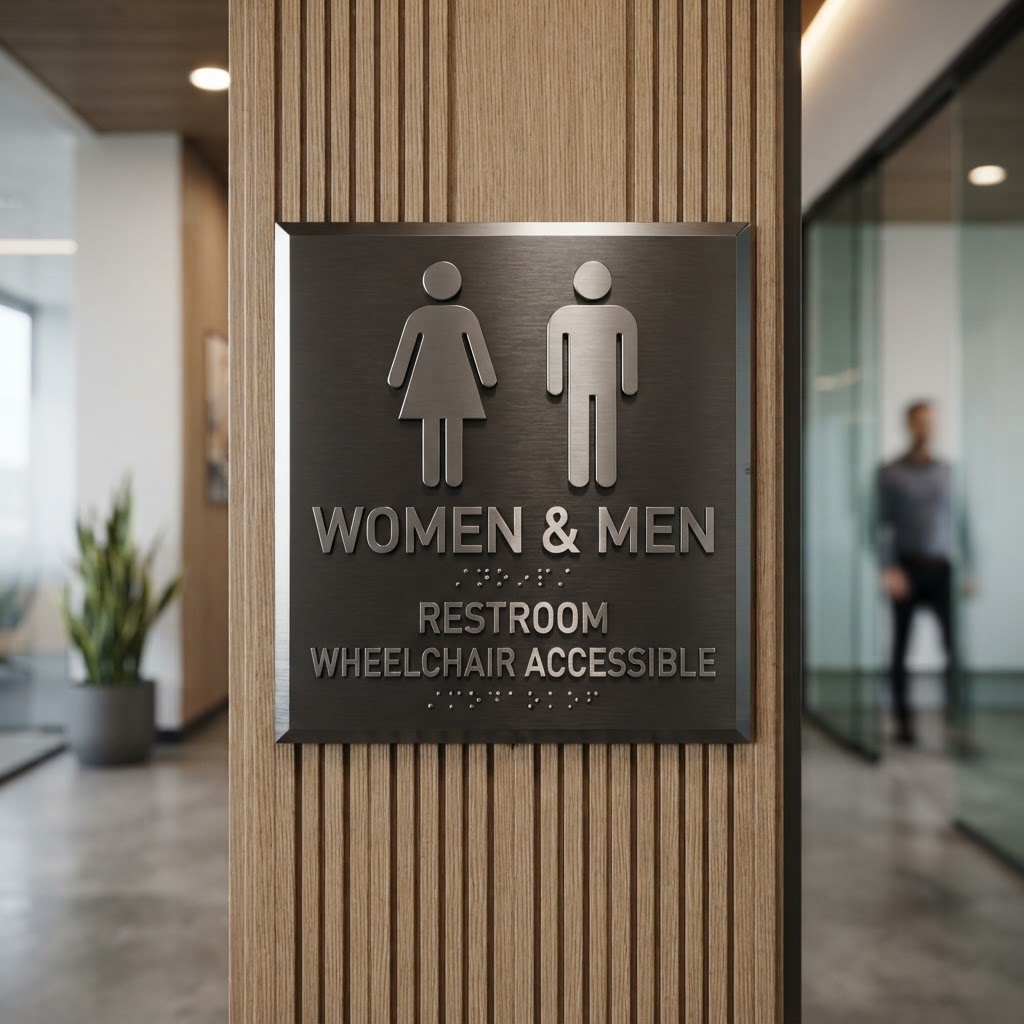
The biggest thing people get wrong is ignoring the tactile requirements. If you are ordering accessible metal signs, you need raised characters. We use high-precision laser engraving and specialized mounting techniques to ensure those letters have the right height and depth. The standard calls for characters to be raised at least one thirty-second of an inch. If you go too thin, the sign fails. If the edges are too sharp, it is not user friendly. It is a precise balance. We have spent years fine-tuning our metal engraving process to make sure every sign that leaves our shop meets these specs perfectly.
Why metal is the gold standard for your building
You might be tempted to go with plastic or vinyl because they seem cheap. I get that. But here is the thing. Plastic signs in a high-traffic commercial building in the Texas heat or humidity eventually warp, crack, or peel. Metal is different. When we engrave a stainless steel or aluminum plate, that information is part of the metal itself. It does not fade. It does not peel off the wall.
Beyond the durability, metal just looks professional. When a client walks into your office in New Braunfels, the signage is part of their first impression. A flimsy plastic sign that is barely stuck to the door with double-sided tape says you do not care about the details. A custom, laser-engraved metal sign says you value your space and the people who visit it. Plus, from a cleaning perspective, you can wipe down metal signs with just about anything without worrying about damaging the text or the surface finish.
Placement matters more than you think
You can buy the most beautiful, perfectly compliant sign in the world, but if you hang it on the wrong side of the door, it is useless. The ADA rules are surprisingly specific about this. Generally, you want your signs mounted on the latch side of the door. If you have a set of double doors, things get a little trickier, and you might need to move that sign to the right side of the entire assembly.
Height is the other big one. We always tell our local customers to aim for a mounting height of forty-eight inches at the bottom of the lowest tactile character. You want to make sure the top of the highest character is no more than sixty inches off the floor. It sounds like a lot of measuring, but it keeps you from getting hit with those compliance headaches later on. We have seen business owners spend thousands on signage only to have to redo everything because they hung them at eye level for a standing adult, totally missing the requirements for someone using a wheelchair. Do yourself a favor and double check the measurement before you start drilling holes in your walls.
Avoiding the common traps
One mistake we see constantly is businesses trying to be too clever with their font choices. I love a cool, stylized logo as much as the next person. But for ADA signage, simple is better. You need a sans-serif font. The letters need to be proportional. If you cram a long word into a tiny metal plate, the spacing between the letters will be too tight, and the sign becomes unreadable for someone with low vision.
Another tip is to watch your contrast. You need a high level of contrast between the characters and the background. We usually recommend a dark metal background with light colored raised lettering or the reverse. If you try to do a brushed silver sign with white lettering, it is going to be impossible to read in dim light. Stick to the high contrast rules. It makes the space better for everyone, not just those who require accessible features.
Why you should care about the details
At the end of the day, these signs are about respect. When you invest in high quality metal signs for your business, you are telling every person who walks through those doors that they belong there. You are removing the guesswork. Whether it is a bathroom sign, a room label, or a directional sign leading to the exit, getting it right the first time saves you money and stress.
We have been doing this work in New Braunfels for a long time. We know the local codes and we know how to make metal look great while staying strictly within the guidelines. You do not need to be an expert in federal accessibility laws to get compliant signage. You just need a partner who knows how to handle the heavy lifting of the fabrication and the technical requirements.
If you are working on a building project or just realize your current signage is looking a little tired, give us a shout. We are happy to look at your layout or discuss what kind of metal finishes will match your branding while still keeping you safe from compliance issues. You can stop by the shop or just drop us a message, and we can help you figure out exactly what your space needs to look sharp and stay accessible.
Tell us about your project
Share the basics and we will come back with pricing, options and a timeline. No obligation.